Using Slate UI Classes from C++
Using Slate UI Classes from C++
Updated for Unreal Engine 5.0
Background
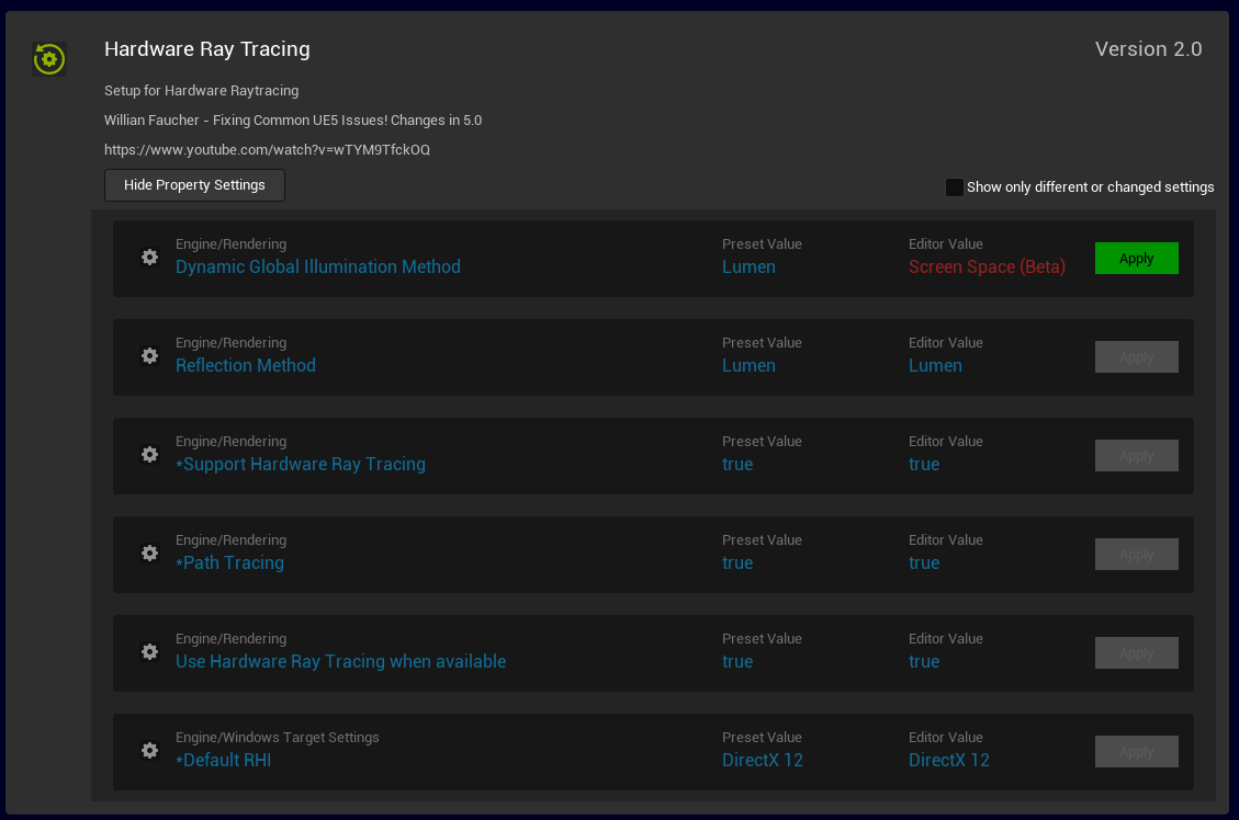
The notes here were made in the course of creating a plugin which checks a project configuration against a known-good collection of configuration settings, for example to check that all the settings required for hardware raytracing have their correct values, and have to options to display and change the current settings, as shown here:
Overview
Slate is a cross-platform user interface framework for creating tool and in-game UI.
Slate is used by the default code generated when
creating a new plugin.
When creating a new plugin the generated code for the main window of the plugin looks like this:
class SPresetBrowser : public SCompoundWidget
{
	SLATE_BEGIN_ARGS(SPresetBrowser)
	{
	}

	SLATE_END_ARGS()

	virtual ~SPresetBrowser();

	/** Widget constructor */
	void Construct(const FArguments& Args, const TArray< TSharedRef<FPreset> >& );
};
This shows two key features of Slate:
- The use of the SLATE_BEGIN_ARGS/SLATE_END_ARGS macros to declare arguments
- The Construct() method which is where the actual UI objects are created.
The code used in the examples below is based on the concept of a 'preset', which is a group of editor properties like the ones shown in the image above. Each property has fields which identify it such as the screen prompt in the project settings editor, and the target value.
Object Hierarchy
The data objects for this plugin are listed in the table below. The data objects form a hierarchy, and so do the UI widgets representing each data object.
| Data Object | Details | UI Widget |
|---|---|---|
| FPresetList | Holds all of the data objects for the entire plugin | SPresetBrowser |
| FPreset | Holds all of the data for one preset, including a list of properties and their desired values | SPresetTile |
| FPresetSetting | Holds the data about one property such as name, type, desired value | SPresetSettingTile |
The data objects have a hierarchy like this:
- FPresetList
- FPreset
- FPresetSetting
- FPreset
And the corresponding UI widgets have a hierarchy like this:
- SPresetBrowser
- SPresetTile
- SPresetSettingTile
- SPresetTile
Each of the UI widgets is a subclass of SCompoundWidget, and each overrides the Construct() method
to create its child widgets.
Each widget which has children has:
- a member which is a list of child data objects and
- a member of type SListView which displays whatever is in the list of child data objects.
Specifically:
- the SPresetBrowser has a list of FPreset objects and an
SListView<FPreset>member - the SPresetTile has a list of FPresetSetting objects and an
SListView<SPresetSettingTile>member
The Construct method
The SPresetBrowser Construct method looks like this:
void SPresetBrowser::Construct(const FArguments& Args,
       const TArray< TSharedRef<FPreset> >& InPresets )
{
	TSharedRef<SBorder> MainContent = SNew(SBorder)
		.BorderImage(FAppStyle::Get().GetBrush("Brushes.Panel"))
		.Padding(0.f)
		[
			SNew(SVerticalBox)
			+ SVerticalBox::Slot()
			.VAlign(VAlign_Top)
			[
				SAssignNew(PresetListWidget, SPresetTileList, SharedThis(this))
			]
		];

	ChildSlot
	[
		MainContent
	];
}
This shows the basic idea of constructing a UI declaratively using c++.
The SNew macro
This creates a widget, as in SNew(SVerticalBox) and makes it available for other calls such as VAlign() as shown above
The SAssignNew macro
This creates a widget like SNew() does but also assigns it to a member shared pointer so it can be referenced later
Slots
Many widgets have positions for child widgets. The positions are called slots. Slots are created and accessed in different ways:
- Some widgets already have slots when the widget is constructed; like the SPresetBrowser itself which is created with a slot called ChildSlot which can be accessed as shown above.
- Widgets such as SHorizontalBox and SVerticalBox (as shown above) need to have each slot added using a call to +SHorizontalBox::Slot() or +SVerticalBox::Slot().
- some widgets have slots in specific places. The SGridPanel uses +SGridPanel::Slot(ColNum, RowNum) to add a child widget in a specific place in the grid
Styles
The call to BorderImage() above calls FAppStyle::Get() to access a style object. Style objects contain brushes
(a rectangular area of a specific color), images, border detail and more. Style objects enable setting values such as
a font size or a widget color in one place (on the style) and reusing it in many places, ensuring a consistent look and feel
to the application. Making changes to the look of an application is easier because the styles are all in one place.
Construction approaches
Widgets can be created and stored in variables, or created inline. The two code samples below do the same thing, the first stores the SVerticalBox widget in a variable and then adds it to the child slot, the second creates it in the child slot directly:
TSharedRef<SBorder> Variable = SNew(SVerticalBox)
	+ SVerticalBox::Slot()
	.VAlign(VAlign_Top)
	[
		SAssignNew(PresetListWidget, SPresetTileList, SharedThis(this))
	]
];

ChildSlot
[
	Variable
];
ChildSlot
[
	SNew(SVerticalBox)
		+ SVerticalBox::Slot()
		.VAlign(VAlign_Top)
		[
			SAssignNew(PresetListWidget, SPresetTileList, SharedThis(this))
		]
	];
];
Some widgets automatically create child widgets. The SListView widget is constructed like this:
PresetListViewWidget =
	SNew(SListView< TSharedRef<FPreset> >)
	.SelectionMode(ESelectionMode::Single)
	.ListItemsSource(&PresetListItems)
	.OnGenerateRow(this, &SPresetTileList::PresetListView_OnGenerateRow)
	.ListViewStyle(FAppStyle::Get(), "SimpleListView");
These lines:
.ListItemsSource(&PresetListItems)
.OnGenerateRow(this, &SPresetTileList::PresetListView_OnGenerateRow)
pass the SListView a list of FPreset objects, and tell it to call PresetListView_OnGenerateRow() once for every row. The PresetListView_OnGenerateRow() method creates and returns the widget(s) which represent one row:
TSharedRef<ITableRow> SPresetTileList::PresetListView_OnGenerateRow(
	TSharedRef<FPreset> Item,
	const TSharedRef<STableViewBase>& OwnerTable)
{
	return
		SNew(STableRow< TSharedRef<FPreset> >, OwnerTable)
		[
			SNew(SPresetTile, SharedThis(this), Item)
		];
}
Buttons
Buttons are implemented using the SButton class and styled using the SButtonStyle class. This code shows creation of a button widget:
const FText ApplyButtonLabel = LOCTEXT("WindowWidgetText", "Apply");

SNew(SButton)
.ButtonStyle( FEditorPresetsPluginStyle::Get(), "PresetTile.ApplyButtonStyle" )
.HAlign(HAlign_Center)
.VAlign(VAlign_Center)
.IsEnabled_Lambda([this]() -> bool
{
	return PresetSetting->EditorValueIsDifferent() || PresetSetting->bRevertable;
})
.ContentPadding(FMargin(4.0f, 4.0f))
.OnClicked_Raw(this, &SPropertySettingTile::OnApplyButtonClicked)
[
	SAssignNew(ApplyRevertButtonLabel,STextBlock)
	.Text(ApplyButtonLabel)
	.Margin(2.0f)
]
This illustrates a number of interesting points:
Buttons are Containers
The SButton object draws a rectangle on the screen. Any text on the button comes from child widgets of the button. This part of the above code shows the creation of a text block which contains the text which appears on the button:
[
	SAssignNew(ApplyRevertButtonLabel,STextBlock)
	.Text(ApplyButtonLabel)
	.Margin(2.0f)
]
Button Styles
The style used here is created with the code below when the plugin is initialized. This code sets the color to be used by the button when the button is in various states such as Normal, Hovered Over, and Disabled. The style is added to the StyleInstance object along with other styles and can be retrieved using the "PresetTile.ApplyButtonStyle" key.
void FEditorPresetsPluginStyle::Initialize()
{
	FColor ButtonColor = FColor::Green;
	FButtonStyle ApplyButtonStyle = FAppStyle::Get().GetWidgetStyle< FButtonStyle >("SimpleButton");
	ApplyButtonStyle.SetNormal(FSlateColorBrush(ButtonColor));
	ApplyButtonStyle.SetHovered(FSlateColorBrush(ButtonColor));
	ApplyButtonStyle.SetDisabled(FSlateColorBrush(FSlateColor::UseSubduedForeground()));
	ApplyButtonStyle.SetNormalForeground(FStyleColors::Black);
	ApplyButtonStyle.SetHoveredForeground(FStyleColors::Black);
	StyleInstance->Set("PresetTile.ApplyButtonStyle", ApplyButtonStyle);
}
To use the style specify the static StyleInstance object for the plugin and key "PresetTile.ApplyButtonStyle" like so:
SNew(SButton)
.ButtonStyle( FEditorPresetsPluginStyle::Get(), "PresetTile.ApplyButtonStyle" )
Callbacks and Events
The lines
SNew(SButton)
.IsEnabled(true)
show the simplest way of specifying a parameter to the IsEnabled method. Other ways exist such as:
-
using
IsEnabled(this, &FMedia::IsAutoDetectEnabled)which takes a pointer to an object and a method to be called on that object. This version calls shared_from_this() on the object parameter to make a shared pointer to the object. It will fail if that object is still being constructed because shared_from_this() cannot be called on a partially constructed object. This method does have the advantage that it uses a shared pointer to keep the referenced object alive. -
using
IsEnabled_Raw(this, &FMedia::IsAutoDetectEnabled)which takes a pointer to an object and method to be called on that object. This version takes a raw pointer and will not call shared_from_this() so can be called when the object has not finished construction. -
usin
IsEnabled_Lambdawhich takes a lambda returning a bool, for example:
SNew(SButton)
.IsEnabled_Lambda([this]() -> bool
{
	return PresetSetting->EditorValueIsDifferent();
})
This means the enabled state of the button can change when the data changes.
-
using
IsEnabled_Static(&FMedia::IsNotCustomEventOverride, FunctionEntryNodePtr)which takes a static function and a parameter -
using
IsEnabled_UObject(Item, &FMedia::GetOwnerIsEnabled)which takes a pointer to a UObject and a member method -
using
IsEnabled_UObject(this, &FMedia::IsImportEnabled, ContextObject)which takes a reference to a method and an additional UObject parameter|
Events
This code shows a callback when a button is clicked:
SNew(SButton)
.OnClicked_Raw(this, &SPropertySettingTile::OnApplyButtonClicked )
Like the Callbacks section above, there are many variations of the OnClicked() method taking different parameters.
The implementation of the OnApplyButtonClicked method looks like this:
FReply SPropertySettingTile::OnApplyButtonClicked()
{
	if (EditorValueWidget.IsValid())
	{
		EditorValueWidget->SetText(FText::FromString(PresetSetting->EditorValue));
	}
	return FReply::Handled();
}
The only special detail to note is that it returns an FReply object telling the editor whether the click was handled or not.
Beware of Logic Errors
The behaviour of a specific widget sometimes depends on the widget it is contained in.
For example this code creates an SListView widget which creates one row for each
of the ten entries in the Data collection:
SNew(SVerticalBox)
+ SVerticalBox::Slot()
.AutoHeight()
[
	SNew(SListView< TSharedRef< DataClass > >)
	.ListItemsSource(&Data)
	.SelectionMode(ESelectionMode::None)
	.OnGenerateRow(this, &SPresetBrowser::OnGenerateRow)
	.ListViewStyle(FAppStyle::Get(), "SimpleListView")
]
but the list view will display without a scrollbar. This is because there is a conflict between the way the height of the SListView is calculated
and the way the height of the containing SVerticalBox is calculated. The SListView needs to know the height of its container so it can calculate
its own height and hence the position of the scrollbar, but because .AutoHeight() is specified on the SVerticalBox the
height of the vertical box is in turn calculated. It is not possible to satisfy both these requirements.
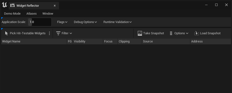
Widget Reflector
This tool is found in the Unreal Editor under Tools|Debug|Widget Reflector. It shows a windows like this:
To use it click the "Pick Hit-Testable Widgets", then click on a widget in your UI, then hit escape. The Widget Reflector
window will now show the hierarchy of widgets and their children like so:
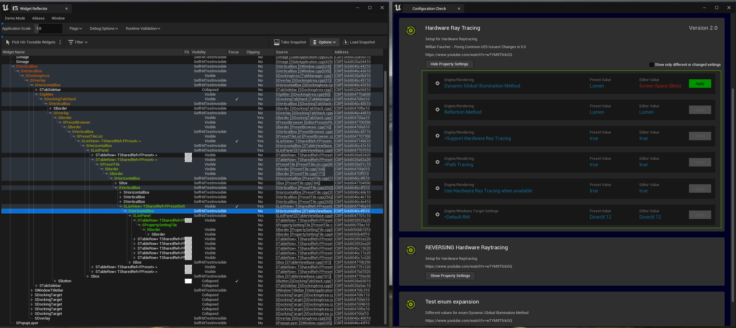
Picking a widget in the hierarchy will highlight it in the UI as shown in the above image by the green box around the selected widget. You can also click on the "Source" column to jump to the line of code which created that widget.
Feedback
Please leave any feedback about this article here